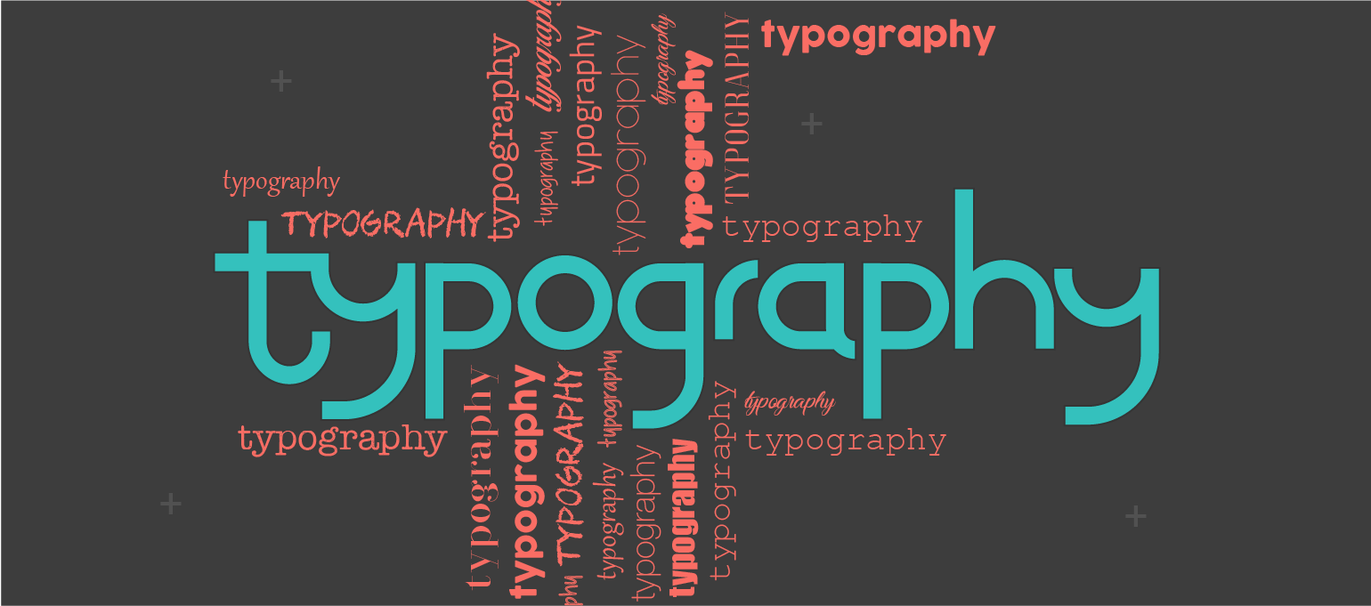
It is said that web design is 95% typography highlighting its importance.
Typography is the art of arranging text in a way that intrigues the reader and makes the text understandable and logical. Typography comprises balanced use of fonts, text size, spacing, line spacing, text position, etc.
A good presentable text is what makes the website attractive. How good is a website that is all fancy, but the text is hard to read and decipher? No, right!
Typography is one of the most important basics that should not be overlooked when it comes to web design. Following basics is what makes the structure of your website strong and makes sure the visitor understands the content of the website and its’ purpose.
Types
Typography can be broadly divided in to two: macro-typography and micro-typography.
Macro-typography: it is the arrangement of the type on the page. It is basically how the paragraphs are placed, the placement of headings, the dimensions and layout of the page relative to the design, etc.
Micro-typography: this focus on the minute details of the type on the page, such as line spacing, font selection, font size, etc.
Fonts Used in Typography
Fonts are one of the most essential aspects of typography. Choosing a font that looks good on screen and is attractive is the one for your website. Certain fonts are most used in web designs and include Proxima Nova, Fira, Georgia, etc.
It is also important to choose the perfect font size that is readable on every type of screen.
Choice of Colours
According to psychology, certain colours are better at attracting people’s attention more than others. Applying this to the website can increase traffic to the website and help your client in their business. Using colours that are more liked by the audience and using good colour contrast for the text and the background makes sure that the viewer can read clearly and understand the content quickly.
Avoid These Mistakes
- Avoid using too many fonts. This will make your page look unstructured and can easily distract your audience. imagine reading a sentence with too many fonts, messy, isn’t it?
- Using simple fonts than fancier ones: the key behind this is that fancy font attracts the viewer to the font itself rather than the content, which we do not want right?
- Keeping a check on the line length: make sure the words in a line are not too much and not too less. Nobody wants to read an awfully long sentence or a noticeably short one that is too narrow.
- Using fonts that make similar letters stand out: letters in certain fonts look similar and it may be annoying for a reader. For instance, a small ‘l’ and a capital ‘I’ look similar. They key to this problem is to use fonts that make them look different and make the content readable.
- Avoid using CAPS for all the text: it can be quite a task to read text that is all capitalized.
- Keep a good spacing between lines: to prevent word congestion and overcrowding that can scare away your audience.
Good web design companies are hard to find. Offering one of the best web design services in Lahore, Pakistan, Web masters EYE brings you amazing services for creating great SEO-friendly websites. Moreover, they offer related services like marketing, planning and more so you will not have to look for related web companies. They also offer fixes and maintenance for ongoing projects and are highly cooperative with their clients. Please visit Web masters EYE for the best experience.


