What is Responsive Website Design?
As we move into a future that demands more and more interaction with devices, responsive web design becomes increasingly important for ensuring websites work across many platforms.The website development company Billiangroup takes care of all aspects of your website to attain the highest levels.
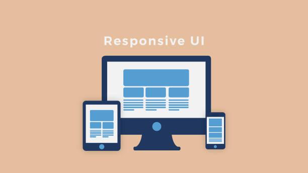
A website that is ‘responsive’ adapts the layout to the viewing device – most often this means adapting from desktop to mobile screen size. This can be accomplished by using either CSS3 or HTML5.
Responsive web design (RWD) has become an important factor in effective SEO strategies, since Google favors mobile-ready sites in its search results, according to research done by Searchmetrics. The key elements of RWD are consistency, calls to action, intuitive navigation, flexible visuals, and optimized images.
What are some benefits of Responsive Website Design?
- Increases conversions
Having a website that is easy for users to navigate will increase your conversion rate. For example, if potential customers visit your site using their handheld device and it takes them too long to find what they were looking for (i.e., an item description or directions), chances are good that they will just leave without making a purchase or finding what they were looking for.
- Enables browsing while on the go
Being able to view your site on different devices while on the go is great for your customers, but it’s also crucial for you. As more people use handheld devices to surf the web, if your site doesn’t pop up in mobile search results they will be less likely to visit you; this means missed opportunities and lost revenue.
- Increases mobile traffic
If mobile users can access all the pages of your website from their handheld device (which they can when using RWD), they may not see your desktop version at all; therefore, increasing mobile traffic drastically.
- Saves time and money
When creating an adaptive website, you have to create different sites for each platform; this means more time and money spent on creating the site. With RWD, you only need to create one version of your site which can be adapted to different devices.
- Improves search engine rankings
Being mobile-friendly means that search engines will rank you higher in their results when someone searches on a handheld device or smartphone (for example, an iPhone). Therefore, these users are more likely to see your website in their results than if you just had a desktop version of your site.
- Increases engagement
A responsive web design makes it easier for users to navigate your website; therefore, users will spend more time looking at your stuff (plus they won’t leave as quickly). This means an increase in time on site and page views, which increases your overall engagement.
The 5 essential elements of a responsive website are:
- Consistency
Keeping a consistent layout, design language and content hierarchy is key to ensuring users understand their current context within the site – whether they are using a mobile device or desktop computer.
In order for your website to fit any device, it must employ responsive web design techniques in your coding. If you’ve been considering going responsive but aren’t sure which elements make up a great responsive website, look no further!
In a regular website, elements such as font size and the spacing between paragraphs are “pixel-based.” In other words, if the text is 14 pixels tall, there will be 16 pixels of space between every line. If the user’s browser window is narrowed to 1/4 of its original width, these values do not change. These settings will remain the same even when you have a completely different screen resolution or viewport size. This creates an inconsistent experience for your viewers. You could have a large number of people viewing your site on a device that has a narrower screen resolution than yours (which would make the elements look too small), while someone else may have an outdated computer with lower quality graphics capabilities which would make it appear as though your site was actually zoomed in (which would make the elements appear much larger than they should).
- Calls to action
Call-to-action buttons and links should be big enough to easily identify what it is and how it looks like. If you have a call-to-action button that says “click here” on only one line with minimum font size, color, and padding/margin, there won’t be any problem with it displayed at regular screen resolutions. However, because the user’s viewport will narrow as he browses through your website by resizing his browser window or by using a mobile device, this same call-to-action button will now look different: the text will automatically adjust itself so that it fits properly in the space, and buttons will appear bigger.
Make calls to action big enough for your customers to see them – avoid putting them in small text at the bottom of the page. Ensure that it is clear what each button does in both desktop and mobile versions, e.g., “add to cart” in desktop vs. “add” or “shopping cart” vs. “+Cart”. The call-to-action buttons should be placed above the fold so users can easily click on them without having to scroll down the page every time they want more information about a product or service provided by your business. Also, ensure that you have links within all content so people don’t have to leave your website just because they can’t find a particular piece of information.
- Intuitive navigation
Your site’s menu should allow users to easily browse through your site on any screen size. Navigation menus are displayed using CSS so that they automatically fit on different screen resolutions without reducing the font size or rearranging them – horizontal menus are often used for this purpose because of their simplicity. If you have a simple website with only several pages, you might just use one row of links under your logo. However, if your site is more complicated with multiple sections, sub-sections, etc., then you might want to consider having a drop-down menu or even an accordion-style menu to maximize pixel viewability on mobile devices while still allowing all of your content to be accessible.
When designing a responsive website, ensure that your visitors can navigate your websites easily in any screen size without having to guess what will happen when they click on a button or enter an address into the search bar. This means you should have all important actions above the fold so people don’t have to scroll down every time they want to add something in their cart, contact you, etc., and also ensure that these actions are big enough for them not to miss clicking on it. Also, keep in mind that users may use different devices for searching and browsing at different times – make sure people can easily switch between modes without losing track of where they were already at or getting frustrated by not finding what they want.
- Flexible visuals
When you create a responsive website design, do not assume that the content of your images will always be displayed in the exact same proportion or scale to fit onto any screen size – remember different devices have limited space for displaying data. This means you should avoid creating many different versions of the same image with different dimensions so you can ensure all of them are flexible enough to maintain consistency across devices. When it comes to photos, only use one that is proportional enough for all screens and then resize it using CSS if required without compromising its quality – this ensures fast loading times while keeping the workload manageable on your end. One last thing to consider when dealing with images is image formats; JPEGs often don’t compress smaller than 20kb, so avoid using this format unless you really need to do so.
Images are loaded in a “smart” way that allows for them to automatically resize themselves when necessary depending on the resolution of the user’s screen. If you have a large image with width and height values in pixels, viewing it on a mobile device will result in stretched images because the physical size of the two screens is very different.
Note how even though your browser window has been narrow, none of the text has disappeared or become illegible due to having too small font sizes; neither did any of the images get cut off by making their dimensions larger than what should typically be expected on a mobile device. Also, note how the sizes of the images automatically adapted themselves to fit well in this particular viewport size.
- Optimized images
When creating a responsive website design, you should always optimize all your images before uploading them – even if they were optimized for previous versions of the website. This is because certain things like device orientation and screen size may change from time to time and affect how people view your site on different devices(e.g., iPhone 6 has a higher resolution than some older versions). The way you deliver images on different screens will make or break your user experience; having big enough images with good quality ensures that visitors only have to download only the data they need for an optimal viewing experience. Also, make sure that you remove unnecessary metadata such as geotags and copyrights in all your files before uploading them to your website.
If you have to use large-sized high-resolution graphics, then you should consider shrinking them before uploading them to your site so that they take less bandwidth and loading speed remains quick for all visitors across devices with different internet connection speeds. There are various free and paid image editing tools available such as Adobe Photoshop, GIMP, and Microsoft Paint that allow you to edit images without compromising quality or special effects/layouts which could only be created using these programs.
Conclusion
All these elements make for a good responsive web design; they work hand in hand to create an intuitive experience that encourages visitors to stay on the page and continue browsing through it with ease. If you want reliable, high conversion rates when it comes to your online presence, then ensure that you include all of this when designing for various screen sizes.
Making websites more accessible by making sure they work properly in different screen sizes can be challenging; however, once this has been achieved one’s online presence increases significantly! We’re here at Pixel Street aims to provide such assistance so our clients don’t have to worry when developing these complex designs from scratch themselves – but if needed we also offer full-service solutions tailored specifically around individual needs.
Author Bio
Khurshid Alam is the founder of Pixel Street, a web design company. He aspires to solve business problems by communicating effectively digitally. In his leisure, he reads, writes, and occasionally plays a game of table tennis.


